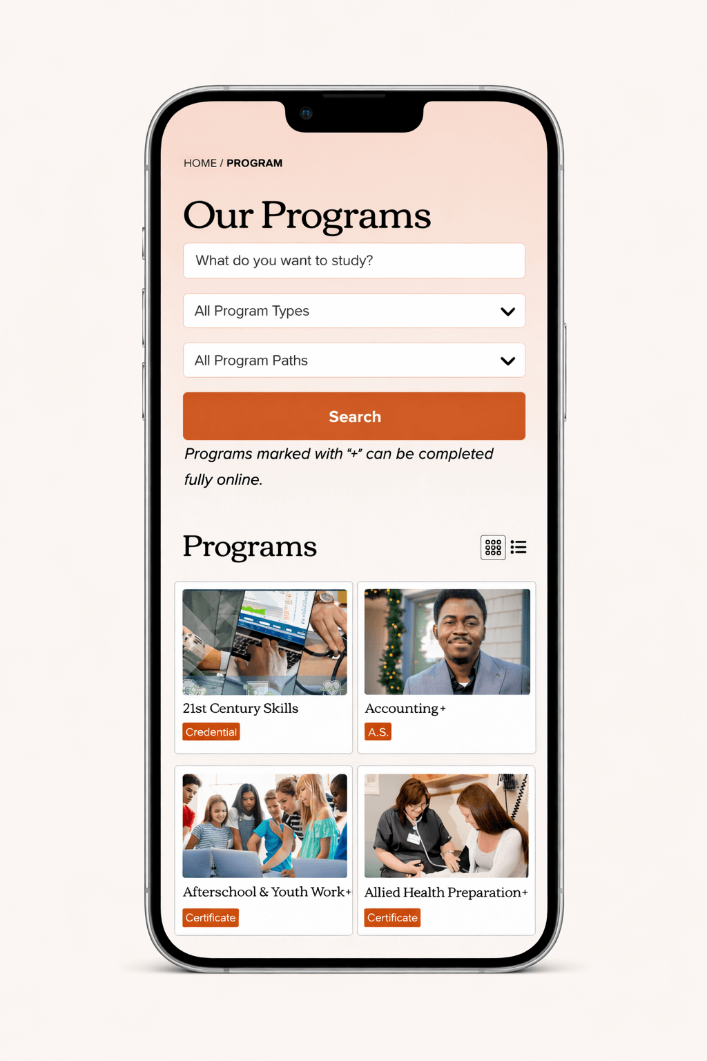
When Community College of Vermont (CCV) came to us, their website had the classic higher-ed challenge: a lot of important information, spread across a lot of pages, for a lot of different audiences. And since so many people are visiting on their phones (usually while juggling about ten other things), we took a mobile-first approach to make sure the site works great where it matters most—on small screens, in real life.
We rebuilt the site in WordPress and used the redesign as a chance to simplify the experience from the ground up. That meant tightening up page layouts, making navigation feel more intuitive, and helping the content breathe a little—so visitors can actually find what they’re looking for without needing a map and a strong cup of coffee. Just as importantly, WordPress gives CCV’s team a flexible, modern platform to keep content fresh without having to call in backup for every update.
The end result is a site that feels cleaner, faster, and easier to use across every device—while giving CCV a foundation that can grow with them. It’s student-friendly, staff-friendly, and built with a “get in, get what you need, and get on with your day” mindset. Which, honestly, is what a college website should be doing in the first place.
