When Rose State College came to us, their website was doing what a lot of higher ed sites do: trying to be everything to everyone—and ending up overwhelming almost everyone. Navigation was cluttered, content was dense, and key pages for prospective students were buried under layers of internal lingo.
We saw an opportunity to simplify, refocus, and make things actually helpful.
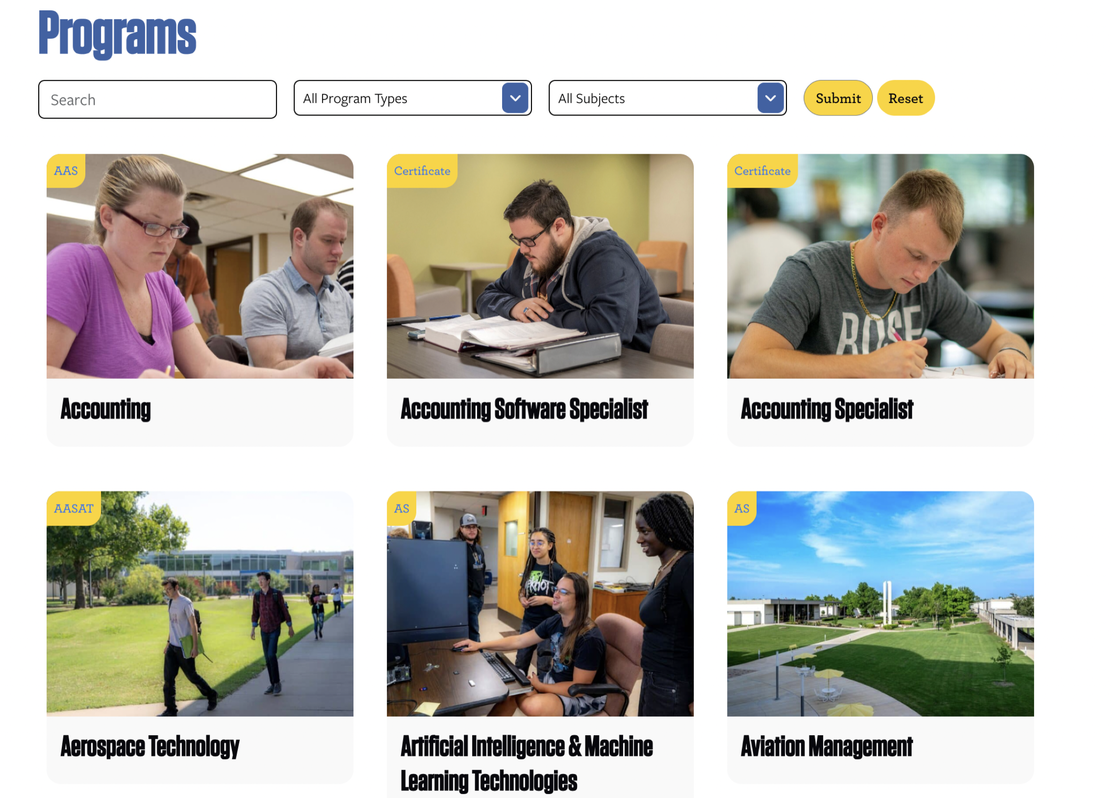
First, we moved the site into WordPress, giving their team a more flexible, modern platform to manage content. Then we completely overhauled the site architecture to better reflect how prospective students think and search. From degree programs to admissions to financial aid, the path to information is now much shorter (and way less frustrating).
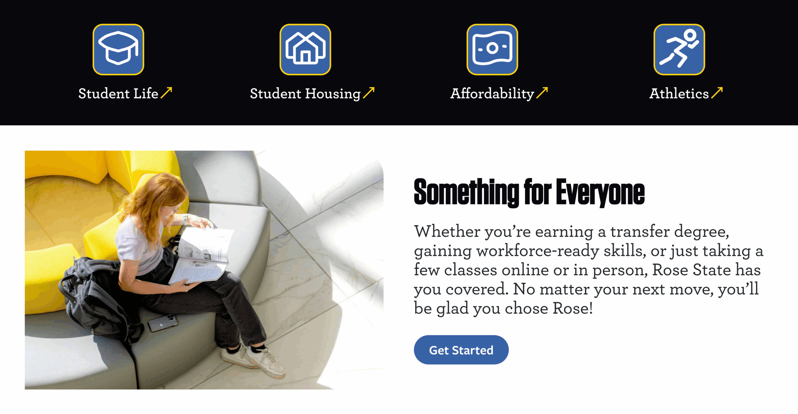
On the visual side, we brought in a clean, modern design anchored by high-quality photography. The site now feels more alive—with images that highlight campus life, student experiences, and the welcoming energy Rose State is known for.
The result? A site that works harder for the college’s recruitment goals—and one that finally puts prospective students front and center.